The advent challenge theme for Christmas Day is 'what does Christmas mean to you?'
It means more time to enjoy being with my family. And I've realised by setting myself this challenge, and insisting on keeping to it I am reducing the time I'll have with them, since they've now all finished work / uni / school.
So I'm not going to stick to it. I hope you don't think less of me but if you do, that's too bad and I'll have to live with it. It's been a bit of a difficult, exhausting (physically and emotionally) Autumn for various reasons and I think I need to cut myself some slack.
After Christmas I intend to spend a lot more time creating and therefore a lot less time writing.
So for the moment at least it's
Au Revoir and Have a very Happy Christmas, full of all the things you need from your own Christmas whether that's excitement or tranquility; turkey, goose, beef, duck or vegetarian and vegan options; country walks or wild parties. Whatever you need to recharge and refresh.
Be healthy, be happy. Create.
Love
Catherine
Sunday 21 December 2014
Thursday 18 December 2014
Who am I? and to which icon is this a little homage to?
 |
| Bet you didn't think my Dundee Cake would end up looking like this! |
This is something of a challenge for me! I once did a full Myers-Briggs type indicator test as part of a high level training course for work. Before you receive the computer analysis of your response you have to do a quick verbal Q&A version with the assessor. Of the four indicators, my verbal version came out opposite to my computer version on three and the fourth indicator (where I matched) was the indicator on which I was, according to the computer, the least firmly placed. The assessor said that either I really was a very flexible person or I didn't know myself very well!
I think it's a little bit of both (unhelpfully). I certainly know myself better now, but I think years of working to other people's expectations and putting other people first (parents, customers, line managers, spouse, children..... one is brought up not to put oneself first), means I cannot always say what I would do or how I would react in situations if it was entirely my choice. As soon as someone else is in the equation, perhaps it changes.
So when working on my own personal style, trend research is actually quite distracting, as can looking at other people's work sometimes be. And when you add in all the various possibilities in terms of medium (pen, pencil, watercolour, oil pastels - my current voyage of exploration - photography, pencil crayon, stitch), then add in all the wonderful possibilities for developing those in Photoshop and Illustrator, it is perhaps no wonder that I am taking so long over this.
Have you got the answer to the question in the title of today's post yet?
Damien Hirst. Icon because (although I don't like or indeed sometimes see the point of some of his work - 'Three ball 50.50 tank' for example, and I query whether his 'spot' paintings can in fact, really be called his since they mostly weren't done by him anyway)
- I think he knows who he is! Yet he doesn't restrict himself to one genre or style - pickled animals, bronze sculptures and spot paintings - some contrasting elements there, for sure!
- His work is thoughtful & explores ideas whether I appreciate those thoughts & ideas or not
- For this quote: "Art goes on in your head. If you said something interesting, that might be a title for a work of art and I'd write it down. Art comes from everywhere. It's your response to your surroundings. There are on-going ideas I've been working out for years, like how to make a rainbow in a gallery. I've always got a massive list of titles, of ideas for shows, and of works without titles."
- and this one, when he wrote to other artists asking for contributions of art for a charity auction: “I remember when I couldn’t give my art away, it wasn’t long ago either. What is there left to say? Money is a key and what we raise from this auction will make a huge difference for a lot of people. It’s great to be able to give something back and make a difference.”
What do you think?
Catherine
Wednesday 17 December 2014
Feeling a bit better - three ding dong patterns for the price of one, plus icons x 9!
Yesterday I was convinced I was no good at this SPD lark. And then (& from talking to others this is often the way it goes), you come from a place of being semi disgusted by all you produce to a place where it all flows again.
I'd started with my Lewis F Day inspired layout:

and set it up as a pattern, but.......it just.....wasn't.....singing to me! I can't explain what that means easily. It's just a general dissatisfaction, an inner knowledge that while the pattern is 'okay', that's all it is. It isn't yet ready. And the breathlessness and lack of energy from my chest infection made me feel incapable of producing better.
Still a bit breathless this morning but I'm much happier.


I know the circle one still needs adjusting and I might play about with some colour variations but overall this is much more what I wanted to achieve. Still not Christmassy in feel, which is interesting but I could possibly see them as (non-specific to season or event) wrapping paper? Or funky wallpaper?
These still use strong photographic elements, mostly for speed but I feel I am not pushing myself enough artistically. While too breathless to design much, I've gone back to Pinterest to redo the ABSPD exercise of trying to define what patterns please me and why. I've drawn my icons for today from that.
There's so much out there, it's very easy to be attracted briefly to all manner of things. I constantly ask myself 'could I live with this pattern or would I soon tire of it?' - I also try to separate out that which I like, from that which I just admire for its skill. Here's (some) of what I came up with - the 'why' is the tricky yet potentially crucial part for moving me forward (the links all go to visuals):
Have a good evening
Catherine
I'd started with my Lewis F Day inspired layout:
and set it up as a pattern, but.......it just.....wasn't.....singing to me! I can't explain what that means easily. It's just a general dissatisfaction, an inner knowledge that while the pattern is 'okay', that's all it is. It isn't yet ready. And the breathlessness and lack of energy from my chest infection made me feel incapable of producing better.
Still a bit breathless this morning but I'm much happier.
I know the circle one still needs adjusting and I might play about with some colour variations but overall this is much more what I wanted to achieve. Still not Christmassy in feel, which is interesting but I could possibly see them as (non-specific to season or event) wrapping paper? Or funky wallpaper?
These still use strong photographic elements, mostly for speed but I feel I am not pushing myself enough artistically. While too breathless to design much, I've gone back to Pinterest to redo the ABSPD exercise of trying to define what patterns please me and why. I've drawn my icons for today from that.
There's so much out there, it's very easy to be attracted briefly to all manner of things. I constantly ask myself 'could I live with this pattern or would I soon tire of it?' - I also try to separate out that which I like, from that which I just admire for its skill. Here's (some) of what I came up with - the 'why' is the tricky yet potentially crucial part for moving me forward (the links all go to visuals):
- William Morris - an obvious one to many perhaps but.....satisfyingly regular but detailed patterns drawn from the natural world. A lot of them are like jewels.
- Piet Mondrian - his more subtly coloured work anyway. I like the geometric shapes coupled with the irregular size of them.
- Paul Lang Kurz Art Nouveau - this link is to The Textile Blog which describes Art Nouveau in terms of interpreting 'the essence of the spirit of nature as if it were a dance', which I quite like.
- Marthe Armitage - simplicity & detail; mostly naturals.
- Paul Klee - linework and colouration more subtle than Mondrian's; abstract
- Rex Ray - strong colours (accent pieces?), bold geometric and abstract shapes with texture
- Sophie Munns - strong abstract shapes, texture, subtle but satisfying colours
- Tim Pugh - using the natural world as material for pattern (like Andy Goldsworthy) - shape, colour, tones, irregular repetitions.
- Ophelia Pang - irregular abstract shapes, irregular geometry, bright use of colour. I also love the sense of her journey - purely visual - as she says 'I'd rather speak in colors and shapes'
So - a mixture of abstract, geometric & naturals, with mostly subtle colours, but some vivid, rich & contrasting ones too. Some I like for their satisfying and detailed repeats; some for their unexpected variations. I like texture, whether that is achieved by detail of patterning or subtlety of colouration and line strength.
I have discovered that although I like some 1950s / mid century work (as they call it) - as a style movement I am not overly drawn to it. Which is a result. I think. Perhaps I need to spend time after Christmas going over my own designs with similar yardsticks......
Tomorrow's pattern theme is 'Festive Food' - yesterday I made our traditional 'double the mixture' Dundee Cake - it may well feature!
Tomorrow's pattern theme is 'Festive Food' - yesterday I made our traditional 'double the mixture' Dundee Cake - it may well feature!
Have a good evening
Catherine
Tuesday 9 December 2014
Normal service will be resumed....when I'm better. But enjoy Jools Holland in the meantime.
Please forgive the break in advent icons - a chest infection is sapping my energy.
Jools Holland was to be my icon for yesterday. Actually Jools and his piano (the two are inseparable in my mind). And what inspiration does Jools bring to the artcraftdesign mix? Passion and energy. And all those patterns in sound.
To see him live is an item on my (before I kick the) 'bucket' list. Enjoy.
No patterns from me today sadly - got to go back to bed again. See you when I see you....
Catherine
Monday 8 December 2014
Planning your patterns - icon guru & hero (8) Lewis F Day
Lewis F Day (google him!) was an English decorative artist and designer, and a one-time vice-president of the Society of Arts. He wrote several books and even contributed to the 1911 Encyclopaedia Britannica. I have a copy of his book 'Pattern Design'. I love this book. I go back to it again and again, sometimes learning, sometimes just enjoying and being soothed by the diagrams & illustrations before I go to sleep.
Today's design challenge theme was 'ding dong'. As in 'Merrily on high' I assume. I don't have a bell but we do own a wrought iron triangle which gets rung on a daily basis to bring everybody down for dinner. So here are some sketches inspired by our triangle and tomorrow I'm going to try to create a pattern planned in a way of which Lewis F Day would approve!


Researching Lewis F Day, I started to want to see and read some of his other books. I've just made the most amazing discovery - you can download them free from this website.
Go on - spoil yourselves!
My sister bought it (on request) for my birthday last year but I never imagined what a joy it would be. It was written in the 1880's so the language can be a bit archaic, long-winded and hard to get your head around. He covers squares, triangles, octagons, circles, how patterns evolve, borders, planning, drop repeats and 'scaffolding' - among others. It is full of the most wonderful (black and white) illustrations - the dotted diagonal lines on this one indicate how the pattern was formed on a diamond shape.
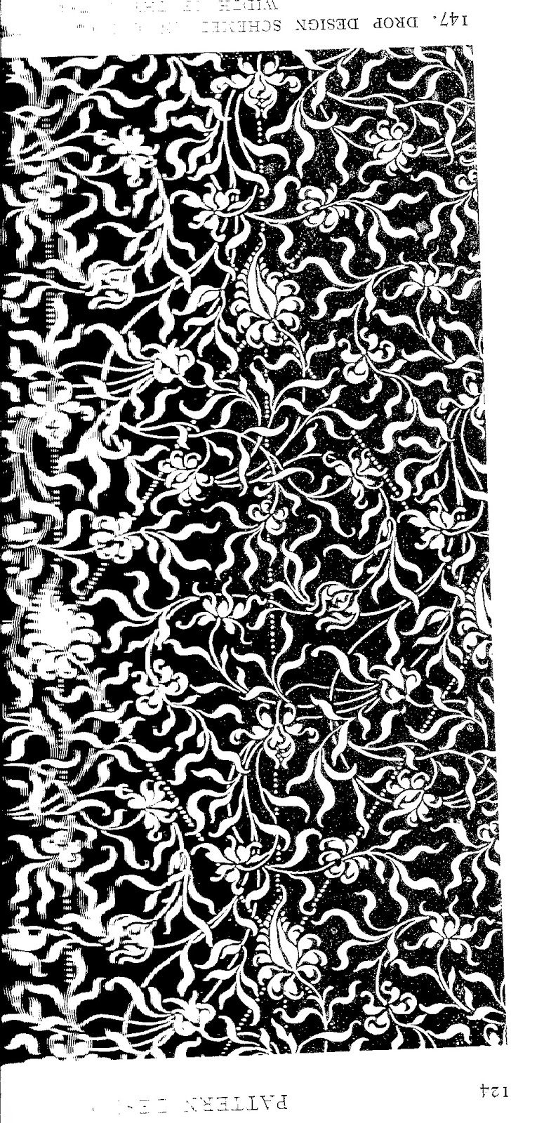
And it's also full of wisdom ("If you would avoid the unforeseen in your completed work - and the unforeseen reveals itself often in the most unsatisfactory manner - system is essential"). Yes, some of it has been eased or even superceded by technology. But that doesn't mean it's irrelevant. And some of the language might even be thought beautiful. Consider this:
And it's also full of wisdom ("If you would avoid the unforeseen in your completed work - and the unforeseen reveals itself often in the most unsatisfactory manner - system is essential"). Yes, some of it has been eased or even superceded by technology. But that doesn't mean it's irrelevant. And some of the language might even be thought beautiful. Consider this:
"Painters unpractised in design assume sometimes that they have only to repeat at given intervals no matter what study from nature, and make good the connection between the repetitions of it, and the trick is done. It is not quite so easy as that.......The natural lines of a flower, determined by no thought of repetition, are scarcely likely to bear repetition very well, and the difficulty of working up to nature, and comprehending such naturalistic details in any satisfactory scheme of composition is extreme. If anything results that way which goes for ornament, it is by accident and not design. Emphatically that is not the way to set about it. A designer makes his flowers grow his way."
Today's design challenge theme was 'ding dong'. As in 'Merrily on high' I assume. I don't have a bell but we do own a wrought iron triangle which gets rung on a daily basis to bring everybody down for dinner. So here are some sketches inspired by our triangle and tomorrow I'm going to try to create a pattern planned in a way of which Lewis F Day would approve!
Go on - spoil yourselves!
Catherine
Sunday 7 December 2014
Andrew Carnegie - icon for advent (7) - Icon of libraries and philanthropy
One can define ArtCraftDesign in terms of 'art' and 'craft' and 'design' but also in terms of the 'arts, crafts and designs' of actually living - trying to live well, honestly, according to one's beliefs and making the most of one's talents.
As a librarian there is obviously a direct connection for me with my icon for today, Andrew Carnegie, whose philanthropic work emphasised public libraries around the world. So today I want to revert to my former public librarian status (I now run a school library rather than co-ordinating the work of several public ones) and ensure you are all aware (and it always amazes me how many people are not aware) of just what you may be able to benefit from - often for free - from public and other libraries as designers and business people. There is much much more you could also benefit from as parents and individuals in your own right but that would take more than one post. And while the following has a British perspective, I encourage those of you from other parts of the world to investigate what's available to you locally too.
Discovering surface pattern design I heard of a book and searched for it on Gloucestershire Libraries online catalogue. I reserved it and it was delivered to my nearest branch. For the next few months that book bounced between me and an unknown other library member in Cheltenham. Every time I reserved it, they returned it to let me have my go and they duly reserved it to borrow it again after me. Share and share alike and a 'greener' use of resources. Plus I didn't commit my own funds until I was sure I needed to own the book (I didn't, as I got what I needed just from borrowing). So try before you buy. Public library membership is free; local charges for reserving books may vary but are kept as low as possible.
Local library authorities vary in the exact services they provide and the books they buy depending on their catchment areas and their budgets. If there is something you think they should have, suggest it. They will not always be able to justify purchasing (eg if it is likely to be just you wanting it), but they will often consider it.
From the main library website for your area, a good link to follow would be to online / virtual or e-reference services. These will often include business research services: Worcestershire Libraries for example offer Cobra (Complete Business Reference Advisor), and British Standards online; other authorities also include something called Kompass - which is business to business information, or MintUK business information. Cornwall Libraries also link to local business help and support from their pages; other local authorities might keep that information separate from their library pages. Internet use in public libraries can often be free or minimally charged.
University and academic libraries won't let you join (unless you are a student or staff member obviously) but many of them do have to allow public access as part of their charter. You won't know what you'll find necessarily, but if your local institution runs art related courses or business, law, etc courses then it's worth a morning spent browsing. Sometimes the most serendipitous 'findings' occur (eg I now know that a book called The Luxury Strategy is held by the University of the West of England in Bristol). Don't forget such institutions may also run short courses and summer schools of interest.
We librarians both honour Andrew Carnegie and curse the difficulty & expense of maintaining, heating, insulating and adapting for modern use such (often listed) buildings.
Let me tell you another reason why he inspires me: I do not know whether I will make my fortune or even a decent living in the surface pattern design / luxury scarf world. I (like most of us) could sometimes wish for a bit more freedom & flexibility in my finances, a bit more security about the future. But right from the beginning I recognise that I am not in the world alone and relatively speaking I am lucky. So 5% of any profit I make will be donated to Unicef. There are many charities I could have chosen but it has taken me till I'm nearly 50 to know what I want to do and have the courage to go for it. How much talent for the world dies when little children die or have to spend their lives fetching water, scrabbling a living from rubbish heaps, are enslaved to make chocolate for the rest of us, and so on? I want to make sure my supply chains are as 'blame free' as possible and that will not be easy. Carnegie built his fortune on steel and that process, I'm sure, was not always 'blame free' but his attitude was that with the wealth created he had a chance to improve things; without it he didn't. Life is ever a compromise.
Gosh. That was all a bit serious. Here's a (very) quick Christmas market pattern to lighten the mood.
Much love
Catherine
As a librarian there is obviously a direct connection for me with my icon for today, Andrew Carnegie, whose philanthropic work emphasised public libraries around the world. So today I want to revert to my former public librarian status (I now run a school library rather than co-ordinating the work of several public ones) and ensure you are all aware (and it always amazes me how many people are not aware) of just what you may be able to benefit from - often for free - from public and other libraries as designers and business people. There is much much more you could also benefit from as parents and individuals in your own right but that would take more than one post. And while the following has a British perspective, I encourage those of you from other parts of the world to investigate what's available to you locally too.
Discovering surface pattern design I heard of a book and searched for it on Gloucestershire Libraries online catalogue. I reserved it and it was delivered to my nearest branch. For the next few months that book bounced between me and an unknown other library member in Cheltenham. Every time I reserved it, they returned it to let me have my go and they duly reserved it to borrow it again after me. Share and share alike and a 'greener' use of resources. Plus I didn't commit my own funds until I was sure I needed to own the book (I didn't, as I got what I needed just from borrowing). So try before you buy. Public library membership is free; local charges for reserving books may vary but are kept as low as possible.
Local library authorities vary in the exact services they provide and the books they buy depending on their catchment areas and their budgets. If there is something you think they should have, suggest it. They will not always be able to justify purchasing (eg if it is likely to be just you wanting it), but they will often consider it.
From the main library website for your area, a good link to follow would be to online / virtual or e-reference services. These will often include business research services: Worcestershire Libraries for example offer Cobra (Complete Business Reference Advisor), and British Standards online; other authorities also include something called Kompass - which is business to business information, or MintUK business information. Cornwall Libraries also link to local business help and support from their pages; other local authorities might keep that information separate from their library pages. Internet use in public libraries can often be free or minimally charged.
University and academic libraries won't let you join (unless you are a student or staff member obviously) but many of them do have to allow public access as part of their charter. You won't know what you'll find necessarily, but if your local institution runs art related courses or business, law, etc courses then it's worth a morning spent browsing. Sometimes the most serendipitous 'findings' occur (eg I now know that a book called The Luxury Strategy is held by the University of the West of England in Bristol). Don't forget such institutions may also run short courses and summer schools of interest.
We librarians both honour Andrew Carnegie and curse the difficulty & expense of maintaining, heating, insulating and adapting for modern use such (often listed) buildings.
Let me tell you another reason why he inspires me: I do not know whether I will make my fortune or even a decent living in the surface pattern design / luxury scarf world. I (like most of us) could sometimes wish for a bit more freedom & flexibility in my finances, a bit more security about the future. But right from the beginning I recognise that I am not in the world alone and relatively speaking I am lucky. So 5% of any profit I make will be donated to Unicef. There are many charities I could have chosen but it has taken me till I'm nearly 50 to know what I want to do and have the courage to go for it. How much talent for the world dies when little children die or have to spend their lives fetching water, scrabbling a living from rubbish heaps, are enslaved to make chocolate for the rest of us, and so on? I want to make sure my supply chains are as 'blame free' as possible and that will not be easy. Carnegie built his fortune on steel and that process, I'm sure, was not always 'blame free' but his attitude was that with the wealth created he had a chance to improve things; without it he didn't. Life is ever a compromise.
Gosh. That was all a bit serious. Here's a (very) quick Christmas market pattern to lighten the mood.
 |
| Joy to the world! |
Much love
Catherine
Saturday 6 December 2014
A brand new advent guru (6) Lidija Paradinovic Nagulov
I love it when people take the trouble to comment on my posts. Mostly this happens via the Facebook pages I post it on - my own, and the ABSPD ones. But Lidija commented via the blog.
I imagine she must have found it via one of those groups but I didn't know her name. She works as 'Celandine Designs' - which name provoked an instant smile from me as it is my father's favourite wild flower. Look at her gorgeous work! So lush.
And of course, I had a nosy around on her blog and found this advice about finding your style. And she's absolutely right - we all want to do everything but equally cannot do everything. We need to make decisions - we need to define ourselves more closely.
I can answer some of the questions Lidija suggests answering: I mostly imagine my work on scarves but also wonder about wallpaper, home decor and fashion. With some of the fun things I've produced in the few days of the Faye Brown design Advent challenge, I can see some outlet for stationery.
I work with different pattern types (floral, abstract, geometrical, mostly) and might have several on a single scarf.
I truly do love my line work - it's getting stronger and more confident and faster on a daily basis. It's flexible too, as I can take it anywhere and use any moment (dentist's and doctor's waiting rooms come to mind of late). I can do it last thing at night in bed before I go to sleep; and I can do it in front of the telly when I'm being sociable with the family and don't really (personally) need to pay attention to the minutiae of 'Guardians of the Galaxy' (though Dr Who - now that's different...!). I mainly see myself using paint as texture and depth. To what level I will continue to use photographic source material (only ever from my own photographs) I'm still mulling.
I work with layering and translucencies, so my colours aren't 'saturated' but nor are they necessarily muted. I'm more naturally drawn to colour contrasts than to analogous colours.
As for who I see buying my work: older women (45+), elegant and confident, whose wardrobe staples are classic in cut and quality and tend not to be overly patterned, but which would be perfectly set off by the jewel-like signature element of one of my scarves.
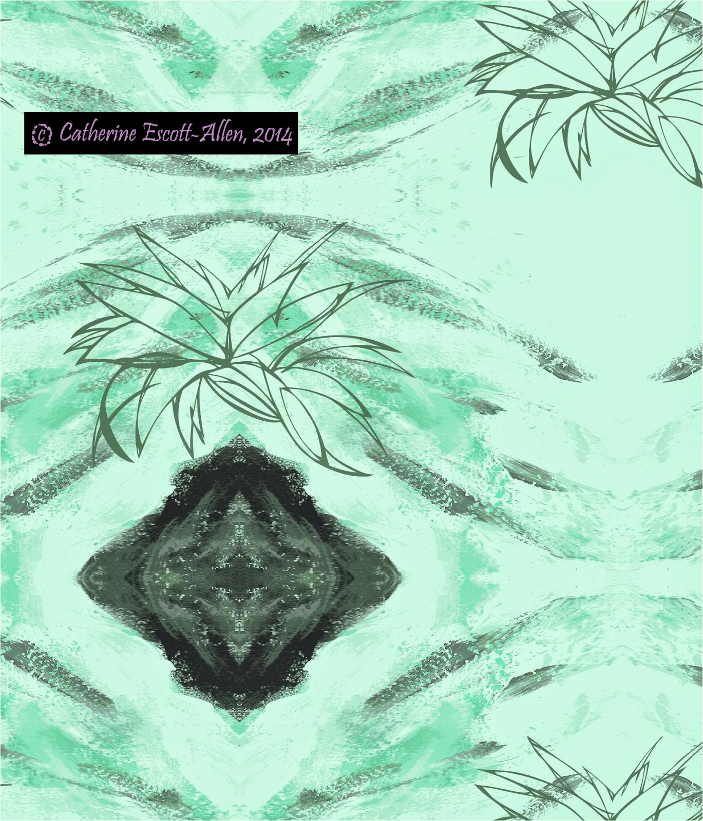
But, as I say, scarves are on the back burner and I'm going to give myself the gift of a few months working on my style without too much reference to anybody else's work. After advent, that is. Today's challenge theme was a Christmas market. Here are some snippets of sketches and tomorrow, rather than doing the Winter Wonderland theme, I'm going to continue working these up and seeing where they go.


I imagine she must have found it via one of those groups but I didn't know her name. She works as 'Celandine Designs' - which name provoked an instant smile from me as it is my father's favourite wild flower. Look at her gorgeous work! So lush.
And of course, I had a nosy around on her blog and found this advice about finding your style. And she's absolutely right - we all want to do everything but equally cannot do everything. We need to make decisions - we need to define ourselves more closely.
I can answer some of the questions Lidija suggests answering: I mostly imagine my work on scarves but also wonder about wallpaper, home decor and fashion. With some of the fun things I've produced in the few days of the Faye Brown design Advent challenge, I can see some outlet for stationery.
I work with different pattern types (floral, abstract, geometrical, mostly) and might have several on a single scarf.
I truly do love my line work - it's getting stronger and more confident and faster on a daily basis. It's flexible too, as I can take it anywhere and use any moment (dentist's and doctor's waiting rooms come to mind of late). I can do it last thing at night in bed before I go to sleep; and I can do it in front of the telly when I'm being sociable with the family and don't really (personally) need to pay attention to the minutiae of 'Guardians of the Galaxy' (though Dr Who - now that's different...!). I mainly see myself using paint as texture and depth. To what level I will continue to use photographic source material (only ever from my own photographs) I'm still mulling.
I work with layering and translucencies, so my colours aren't 'saturated' but nor are they necessarily muted. I'm more naturally drawn to colour contrasts than to analogous colours.
As for who I see buying my work: older women (45+), elegant and confident, whose wardrobe staples are classic in cut and quality and tend not to be overly patterned, but which would be perfectly set off by the jewel-like signature element of one of my scarves.
But, as I say, scarves are on the back burner and I'm going to give myself the gift of a few months working on my style without too much reference to anybody else's work. After advent, that is. Today's challenge theme was a Christmas market. Here are some snippets of sketches and tomorrow, rather than doing the Winter Wonderland theme, I'm going to continue working these up and seeing where they go.
Friday 5 December 2014
Guru for advent (5): Michelle Fifis... and penguin development
A few years ago when I first started getting into this Surface Pattern Design thing one of the first blogs I tripped over was PatternObserver, written by Michelle Fifis. It also seemed back then that there were two main online surface pattern design courses: Michelle's 'The Sellable Sketch' and the 'Art and Business of Surface Pattern Design' courses run by Beth Kempton and Rachael Taylor.
Of the two possible routes I chose the British one (ABSPD) - in my ignorance I felt safer with home turf and it was a little cheaper. Both companies now run a range of course levels and content. As with any text book, different styles suit different people; I believe the main difference between them maybe that you get more individualised feedback from the course leader via Michelle's courses - which may account for the higher cost. Also sometimes I feel I see higher quality art based work on Michelle's site. But I could be wrong.
Despite not taking her course, following Michelle has still been immensely valuable. From time to time she offers free 'mini-courses' (eg 'Artwork Preparation: a freelancer's guide') and webinars (eg Marketing can be beautiful') on aspects of the business, which are like 'tasters' for the full courses. This allows you to sample her style of teaching at the same time as learning a new skill or gaining insight into the business. Brwosing her website just now I also came across other options and useful help eg the opportunity to have Artwork Critiques and a page of helpful design resources.
I'm not looking for another course at present; I have just done ABSPD Module Two but was in fact too ill over several weeks properly to engage with it. I feel also that I need to allow myself a good long while to squeeze all the goodness out of what I have learnt so far and work on consolidating my style. I sent Michelle a feedback email after the 'Marketing can be beautiful' webinar and was delighted to receive an email back:
I do find Michelle's style helpful; I do find the idea of personalised feedback from the course leader attractive. And I believe I'm right in thinking that Ellie Cashman (one of my favourite designers as you know) also took courses from both sources (particularly praising Michelle's 'Ultimate Guide to Repeats'). So if the time comes when I'm ready to invest again I may well be looking in that direction.
And so to penguins. I'm chickening out of Faye Brown's actual challenge today: snow creatures, because to be frank, I am inspiration-less on that front. Instead I'm taking yesterday's work further.....and in doing so it's becoming less obviously penguin-y (which means it wouldn't recognisably fit any penguin trend....).
Using my rock-hopper's monstrous head-dress as inspiration I develop line work that is more adventurous.......
Not being sure I like the colours I try variations:
Of course, people responding to my post yesterday liked the cute penguins and the dancing penguins. I'm really not sure what anyone is going to think of this.... Christmassy, it ain't!
Let me know, someone!
Catherine
Of the two possible routes I chose the British one (ABSPD) - in my ignorance I felt safer with home turf and it was a little cheaper. Both companies now run a range of course levels and content. As with any text book, different styles suit different people; I believe the main difference between them maybe that you get more individualised feedback from the course leader via Michelle's courses - which may account for the higher cost. Also sometimes I feel I see higher quality art based work on Michelle's site. But I could be wrong.
Despite not taking her course, following Michelle has still been immensely valuable. From time to time she offers free 'mini-courses' (eg 'Artwork Preparation: a freelancer's guide') and webinars (eg Marketing can be beautiful') on aspects of the business, which are like 'tasters' for the full courses. This allows you to sample her style of teaching at the same time as learning a new skill or gaining insight into the business. Brwosing her website just now I also came across other options and useful help eg the opportunity to have Artwork Critiques and a page of helpful design resources.
I'm not looking for another course at present; I have just done ABSPD Module Two but was in fact too ill over several weeks properly to engage with it. I feel also that I need to allow myself a good long while to squeeze all the goodness out of what I have learnt so far and work on consolidating my style. I sent Michelle a feedback email after the 'Marketing can be beautiful' webinar and was delighted to receive an email back:
Hi Catherine!
Thank you so much for this kind and thoughtful email.
When looking for your style, I recommend sketching a little bit everyday until you find "your groove". Maybe focus less on what's on the internet and more on your sketchbook!
Much love,
Michelle
I do find Michelle's style helpful; I do find the idea of personalised feedback from the course leader attractive. And I believe I'm right in thinking that Ellie Cashman (one of my favourite designers as you know) also took courses from both sources (particularly praising Michelle's 'Ultimate Guide to Repeats'). So if the time comes when I'm ready to invest again I may well be looking in that direction.
And so to penguins. I'm chickening out of Faye Brown's actual challenge today: snow creatures, because to be frank, I am inspiration-less on that front. Instead I'm taking yesterday's work further.....and in doing so it's becoming less obviously penguin-y (which means it wouldn't recognisably fit any penguin trend....).
 |
| Original from yesterday |
 |
| Masked first then indexed to 12 colours with a customised palette - interesting! |
-headdress.jpg) |
| ......more of 'me' in this...... |
 |
| 'Lifted' the belly and wing of penguin, indexed, mirrored and then placed line drawn icon |
Not being sure I like the colours I try variations:
 |
| Greener.... |
 |
| Warmer..... |
Of course, people responding to my post yesterday liked the cute penguins and the dancing penguins. I'm really not sure what anyone is going to think of this.... Christmassy, it ain't!
Let me know, someone!
Catherine
Thursday 4 December 2014
Icon for Advent (4) Laura Ashley - 'nuff said?
What do we all think we know about Laura Ashley?
Roses? 'English'? Classic? Florals? Frocks?
Think also:
Roses? 'English'? Classic? Florals? Frocks?
Think also:
- self taught (to support husband's change of career)
- started small - in the (London) kitchen after the children had gone to bed
- actually she was Welsh
- actually she always prefered the home furnishing side
- it wasn't just Laura - husband Bernard designed the printing machines and turned out to be a natural 'colourist'; their children also became involved in the business
- they lived above the shop in Machynlleth, Wales for six years
- supporter of the 'local' economy; philanthropist
May I recommend her biography? Lots to be inspired by and to learn from.
Faye Brown Design's Advent challenge theme today is penguins. I fail to see what they have to do with Advent, really - cute and saleable maybe? Cute isn't something I'm ever that drawn to, so decided to just experiment with different media and some prompts from the internet. Don't really like any of them yet and I'm definitely rusty with anything other than line drawing. More work needed I think.
Faye Brown Design's Advent challenge theme today is penguins. I fail to see what they have to do with Advent, really - cute and saleable maybe? Cute isn't something I'm ever that drawn to, so decided to just experiment with different media and some prompts from the internet. Don't really like any of them yet and I'm definitely rusty with anything other than line drawing. More work needed I think.
 |
| Line drawn - plain and embellished - from inside my head |
 |
| Rockhopper penguin - acrylics |
 |
| Dancing penguin - pastels |
Wednesday 3 December 2014
Advent calendar guru (3) Andrew Taylor (author) and a discussion of style
I can be quite suggestible so when my sister says some of my designs are really quite upmarket, that's the way I think I ought to go. That's the way I develop my scarf designs and I'm very happy with the brand, logo and packaging ideas I have for them.
But just as some days my taste / requirement from music is classical (sometimes challengingly so) and on other days my need is to put Pharrell William's 'Happy' on repeat and dance madly around the lounge (whatever you think of him, that song just is 'happy'), so my pattern imperatives also vary.
I use photographic sources, sometimes as the main image, sometimes as background; I also use line work and original coloured artwork in various media. Sometimes I combine all these things in one design; sometimes not. And so a 'reason to be cheerful' about delaying the scarves, is that I can spend more time ensuring they have a more coherent 'house style'.
But I still chafe against the idea of limiting myself, of squashing parts of me that still want expression out in the world. And that brings me to my inspiration guru of the day, author Andrew Taylor. Andrew is an award winning writer whom some of you might know: he came to prominence particularly when his novel 'The American Boy' was chosen for Richard and Judy's book club (in that club's earlier days).
I ran public library events with Andrew a couple of times. He's very interesting to listen to and you don't hear the same anecdotes twice. My point about him is, he has not limited himself. His 'Lydmouth' crime series has many fans yet is for me at least, sturdily of its type (think Morse / Midsomer Murders) - comfortable crime, in this case set in a fictionalised Forest of Dean / Welsh border area for the added delight of us locals. In fact he hasn't published a 'Lydmouth' novel since 2006.
More recently his work covers much darker psychological and often historical thrillers like 'The Roth Trilogy', or 'Bleeding Heart Square'. His skill with the accurate historical detail and description give the reader a great sense of 'being there'. And, if you actually ever have 'been' there as I have have been (one of his novels mentions the London street on which my sister lives) then the book lives (dances, almost) doubly in your mind as you reconcile the 'now' with the 'then' being described. No expert, I would still put the word 'Literature' (with capital 'L') to Andrew's later work.
My second point therefore should now be obvious and can be underlined if you also read his very first novel - 'Caroline Minuscule'. Andrew has allowed his 'style' to mature over time (years).
And I conclude that I am running before I can walk! My scarves will stay on the back burner for as long as they need to and I will continue to experiment. Which is why I really am enjoying the Faye Brown Designs Advent challenge: achieving something (as we used to say in the library service) 'quick & dirty' - not stressing - just playing. Letting it flow.
 |
| Christmas trees worked up from yesterday |
 |
| Christmas tree decoration for today |
Tuesday 2 December 2014
Advent calendar of gurus, heroes & icons (2) Sir Nicholas Serota....
... and I didn't even know his name till this week.
Watching the Turner Prize last night, it turns out that Nicholas Serota, director of Tate Modern has been instrumental in it for many years. And while I don't really remember the first Turner Prize, haven't always paid attention to it, and haven't necessarily at the time always understood or appreciated the art it offered, I have increasingly felt its presence in the national psyche. The Prize is an annual opportunity to raise art in our consciousness.
Why is art important? A complex and for some contentious question. There is of course, the economic argument:
And this is important. It allows the employed to earn their living and support themselves and those less fortunate to have a better chance of being supported through tax revenue. But no less important is art for art's sake - because it enriches us, enlivens us, causes us to make connections both in our heads and socially. Two personal examples: one from Tate Modern and one from Gloucester Cathedral near where I live.
Visiting Tate Modern one year I entered a gallery and high on the diagonally opposite wall hung a long piece of heavy blue canvas on a rail. Its drape could be adjusted in various ways causing it to be interpreted differently. Apparently one draping is likened to what I shall daintily call 'the male member'. That wasn't what I saw. For me it was a Katharine Hepburn or Lauren Bacall film star dress from the 1930's or 40's. Because it was my brain and my memories and my likes and dislikes and my artistic and fashion aspirations it was interacting with. Art as an individual experience. I bought a post card of it. I have it still. I'm going to dig it out and design that dress.......
Gloucester Cathedral hosts an annual exhibition of sculpture. It is one of the very best things that takes place in my city and people come from quite some distance. We get to see new works and older works, works from this country, works from abroad and from local artists. We also get Henry Moore sculptures and Damien Hirst's. We count ourselves very lucky. The event is a triple whammy of pleasure though.... We get to see all this imported art but we also get to remind ourselves of the beauty, art and workmanship that exists in the Cathedral day in, day out. And the third whammy is that people don't just view in silence. They talk about it. Even to strangers. 'That's amazing', 'oh, I love that', 'that was done by one of my neighbours', 'that's my favourite', 'I never would have thought to put that with that, but now they have - it just makes you feel...', 'it's good - you can tell it's good.....but ...I couldn't live with it.' 'couldn't you just take her home and have her striding across your house, looking out into the distance like that.' And so on.
Life enhancing. And so, therefore, has Nicholas Serota been. Thank you.
A quick thank you also to my fabulous niece Michelle who told me her favourite fashion magazine was 'Red' and caused me to pick it up and read it in the dentist's waiting room. Serious business, this trend research.
Faye Brown Design's Advent Challenge today was Christmas Trees - it's been a long day so here's just a couple of quick sketches to be worked up properly tomorrow:

Watching the Turner Prize last night, it turns out that Nicholas Serota, director of Tate Modern has been instrumental in it for many years. And while I don't really remember the first Turner Prize, haven't always paid attention to it, and haven't necessarily at the time always understood or appreciated the art it offered, I have increasingly felt its presence in the national psyche. The Prize is an annual opportunity to raise art in our consciousness.
Why is art important? A complex and for some contentious question. There is of course, the economic argument:
'Businesses in the UK arts and culture industry generated an aggregate turnover of £12.4 billion
in 2011, which is 3.5 per cent lower than its peak in 2008. The subsets of the arts and culture
industry’s productive activities of book publishing, performing arts and artistic creation are the
largest contributors to the industry’s aggregate turnover performance.
This led those businesses to contribute an estimated £5.9 billion of gross value added (GVA) to
the UK economy, also in 2011. However, the GVA contribution of these businesses has grown
since 2008, in contrast to turnover. Closer analysis reveals that businesses in the arts and
culture industry have been successful in cutting costs and have thus, by increasing their GVA,
increased their contribution to UK GDP even as the wider economy contracted.'
The contribution of the arts and culture to the national economy, Report for Arts Council England and the National Museums Directors’ Council May 2013
Visiting Tate Modern one year I entered a gallery and high on the diagonally opposite wall hung a long piece of heavy blue canvas on a rail. Its drape could be adjusted in various ways causing it to be interpreted differently. Apparently one draping is likened to what I shall daintily call 'the male member'. That wasn't what I saw. For me it was a Katharine Hepburn or Lauren Bacall film star dress from the 1930's or 40's. Because it was my brain and my memories and my likes and dislikes and my artistic and fashion aspirations it was interacting with. Art as an individual experience. I bought a post card of it. I have it still. I'm going to dig it out and design that dress.......
Gloucester Cathedral hosts an annual exhibition of sculpture. It is one of the very best things that takes place in my city and people come from quite some distance. We get to see new works and older works, works from this country, works from abroad and from local artists. We also get Henry Moore sculptures and Damien Hirst's. We count ourselves very lucky. The event is a triple whammy of pleasure though.... We get to see all this imported art but we also get to remind ourselves of the beauty, art and workmanship that exists in the Cathedral day in, day out. And the third whammy is that people don't just view in silence. They talk about it. Even to strangers. 'That's amazing', 'oh, I love that', 'that was done by one of my neighbours', 'that's my favourite', 'I never would have thought to put that with that, but now they have - it just makes you feel...', 'it's good - you can tell it's good.....but ...I couldn't live with it.' 'couldn't you just take her home and have her striding across your house, looking out into the distance like that.' And so on.
Life enhancing. And so, therefore, has Nicholas Serota been. Thank you.
A quick thank you also to my fabulous niece Michelle who told me her favourite fashion magazine was 'Red' and caused me to pick it up and read it in the dentist's waiting room. Serious business, this trend research.
Faye Brown Design's Advent Challenge today was Christmas Trees - it's been a long day so here's just a couple of quick sketches to be worked up properly tomorrow:
Monday 1 December 2014
A personal advent calendar of heroes, gurus and icons (1)
I just thought I'd spend December paying tribute to people I admire and / or who have influenced me on my journey. 'Tis a time to be thankful. Also gifted to you in the spirit of one of 'The 7 habits of highly effective people' - reading about other successful people. Although defining 'effective', like defining 'successful' is a relative exercise in itself, depending on you and your own values.
In no particular order, I present Muriel Gray. Many of you will know of her as a writer, journalist and broadcaster and may recently have seen her on news programmes when Glasgow College of Art burnt down as she is Chair of the board of governors there. In researching this little piece I've become aware of so much more about her and of so much more I want to know.
I first became aware of her as an interviewer in the early days of The Tube. With her short dyed blond hair, her gangly figure and individual clothing style, she was very different from the people I'd grown up with. Obviously knowledgeable and with opinions, I took to her and her Scottish accent immediately, whilst also being slightly intimidated by her. The intimidation passed with the years..... I believe her to be a very warm and genuine person. There are two specific instances I want to mention: years ago I heard her interviewed on the radio about rambling (she is a great walker) and she talked about prefering that to spending Saturdays in the 'shopping sheds' that outlie all towns and cities. A comment that caused me to re-evaluate my own relationship with such sheds and the value of shopping as an entertainment in itself.
And I chiefly recall a wonderful BBC2 series she hosted where she gathered up a group of ordinary people from the North East who had never had much to do with art and artists. She took them on a tour of art galleries around the country, looking at all kinds of work, old and new, modern and traditional. At the end of the series they were each able to choose one piece of work they had seen, the one that had had most impact on them. That piece of work was transported to their own homes and hung there for a day. In the course of the programmes I and these people were introduced to artists and genres we had never heard of. Our eyes were opened and so (often) were our hearts, with that magical and somewhat unfathomable power that certain pieces of art have to connect with the individual. Curmudgeonly 'all this art's a waste of time' attitudes were transformed unexpectedly and while some people's choices were predictable (the woman who started out liking Constable's The Haywain still chose that to hang in her living room), others were much much less so. Fascinating to watch and feel and try to second-guess the transformations taking place. A series I'd love to see again; a series the making of which I'd love to see repeated on a regular basis.......A series I have tried and failed to find or name. Reality TV at its absolute (& quite early) best.
So I think the thing I like best about Muriel is her great advocacy of the arts for everybody - for everybody to appreciate it, for everybody to 'do' it.
Two further gifts for you today: a photograph from today's walk - starry leaves for the Advent calendar (when I was a child, you didn't get chocolate - the picture behind the calendar door was the exciting thing in itself. Here's to re-instating that spirit! Not, you understand, that I have anything against chocolate.....).
and a quick Santa's hat - for the 2014 Advent challenge from Faye Brown Designs:

In no particular order, I present Muriel Gray. Many of you will know of her as a writer, journalist and broadcaster and may recently have seen her on news programmes when Glasgow College of Art burnt down as she is Chair of the board of governors there. In researching this little piece I've become aware of so much more about her and of so much more I want to know.
I first became aware of her as an interviewer in the early days of The Tube. With her short dyed blond hair, her gangly figure and individual clothing style, she was very different from the people I'd grown up with. Obviously knowledgeable and with opinions, I took to her and her Scottish accent immediately, whilst also being slightly intimidated by her. The intimidation passed with the years..... I believe her to be a very warm and genuine person. There are two specific instances I want to mention: years ago I heard her interviewed on the radio about rambling (she is a great walker) and she talked about prefering that to spending Saturdays in the 'shopping sheds' that outlie all towns and cities. A comment that caused me to re-evaluate my own relationship with such sheds and the value of shopping as an entertainment in itself.
And I chiefly recall a wonderful BBC2 series she hosted where she gathered up a group of ordinary people from the North East who had never had much to do with art and artists. She took them on a tour of art galleries around the country, looking at all kinds of work, old and new, modern and traditional. At the end of the series they were each able to choose one piece of work they had seen, the one that had had most impact on them. That piece of work was transported to their own homes and hung there for a day. In the course of the programmes I and these people were introduced to artists and genres we had never heard of. Our eyes were opened and so (often) were our hearts, with that magical and somewhat unfathomable power that certain pieces of art have to connect with the individual. Curmudgeonly 'all this art's a waste of time' attitudes were transformed unexpectedly and while some people's choices were predictable (the woman who started out liking Constable's The Haywain still chose that to hang in her living room), others were much much less so. Fascinating to watch and feel and try to second-guess the transformations taking place. A series I'd love to see again; a series the making of which I'd love to see repeated on a regular basis.......A series I have tried and failed to find or name. Reality TV at its absolute (& quite early) best.
So I think the thing I like best about Muriel is her great advocacy of the arts for everybody - for everybody to appreciate it, for everybody to 'do' it.
Two further gifts for you today: a photograph from today's walk - starry leaves for the Advent calendar (when I was a child, you didn't get chocolate - the picture behind the calendar door was the exciting thing in itself. Here's to re-instating that spirit! Not, you understand, that I have anything against chocolate.....).
 |
| Starry leaves for the 1st December |
and a quick Santa's hat - for the 2014 Advent challenge from Faye Brown Designs:
Wednesday 26 November 2014
Milestones in self-belief
Milestone 1
Late 2013, on a quick trip to London, I finally visit Tate. A great admirer of David Hockney, particularly his Yorkshire paintings, I've only seen his earlier works in books and not been entirely convinced by them. 'A Bigger Splash' seems somewhat 'flat' on the page but up close, personal and 'live', I see the layering and detail of the brushstrokes and understand the whole piece in a deeper way.
The milestone moment really comes when I see 'Mr & Mrs Clark and Percy'. Not that interesting on the pages of a book (who cares about these people?), the reality is a large canvas containing a huge variety of texture and stroke and, most significantly for me, what could have been regarded as an error. I realise I've always thought true artists didn't make these. That this was what marked them out as true artists, truly gifted. Something to which I could never hope to aspire. But there, where the woman's hand meets her hip, you can tell Hockney changed his mind about the way it was shaped or proportioned. You can tell he has filled in his 'mistake' in colours that don't quite match. And yet he is (for me) the God 'Hockney'. His work hangs in Tate. And if he can change his mind about something and still allow his development, process and improvements to be visible, then what am I afraid of?
Milestone 2
The same visit to London. Quick breakfast at Giraffe with my sister and brother-in-law before returning home. My brother-in-law takes issue with my mealy-mouthed timidity in declaring my artist status.'Of course you're an artist,' he says, 'you do it, you create, you don't just talk about doing it.' And my sister added 'What makes someone an artist, I think, is when they constantly explore and try to develop and improve and question. And you do all that.'
Milestone 3
Though I still refer to myself as a librarian, I also talk about being 'in transition', being more open about having taken redundancy and accepted a part time role to allow myself to explore my potential. I admit to being self taught for two years before allowing myself to commit to (paying for) an industry based course. My self-concept is changing. I talk about my 'design colleagues'. I refer to 'my work' (meaning my design work, my style, what I'm hoping to achieve - not my paid employment as a librarian).
Milestone 4
Needing more more pointed feedback and sensing a trust in the opinions of my design colleague, Whitney-Anne Baker (from the course) I bravely pick up the phone. Going through my work she points out to me that designs I think are terrible or hideous are not in fact so. They just are not my own personal taste. They are useable and probably saleable - it's just that I am not yet satisfied by them (see my sister's comments in Milestone 2).
Milestone 5
The response from fellow guests and the owners at La Grande Maison.
Conclusions? I think my personal dissatisfactions with my work can serve to indicate the paths I should be following next. I don't think I want to be a designer of stationery for example (though I love a beautifully covered notebook or sketchbook).
I am tempted by the idea of wallpaper having learnt to do mock ups and I think I will explore this avenue. And fabric, of course, has long been a temptation. The need inside me to perfect the most beautiful patterns and designs for my scarves is so strong, though, I start to feel I don't want to be a designer of high street patterns. My style (still developing, a lifelong journey) is not, I think, a quick flash in the pan - this season - next season - have it now, reject it next week thing. I want my work to stand the test of longer time than that. It is seeping through me that I want to create a brand. I have not launched my scarves after all this autumn - for several reasons, a main one being that my personal sewing & finishing skills have proved inadequate to the task. Which requires re-costing and finding people who can do it and do it properly.
Which is fine, actually. Despite the title of this blog (I'm beginning to feel it's a bit misnamed), I realise it is a designer that I most want to be - not a maker. And my passion for perfecting the scarf designs is so strong that honestly, if the manufacturing quality and the total package and experience of buying receiving, owning and wearing them is not going to match up to the design quality, there is little point. I want people to love these scarves.

I'd feel the same about the wallpaper.... Can you have a brand that mixes wallpaper with silk scarves? (Insert winking smiley here!)
And talking wallpaper and to counteract the lack of visual stimulus in this post please, please pay a visit to Ellie Cashman Design. I've never met Ellie; I'm not paid to promote her. I've followed her blog (see link to the right) and been inspired by her journey for several years now and I am a total fan. I'd love to interview her for this blog one day.
Enjoy...
Catherine
Late 2013, on a quick trip to London, I finally visit Tate. A great admirer of David Hockney, particularly his Yorkshire paintings, I've only seen his earlier works in books and not been entirely convinced by them. 'A Bigger Splash' seems somewhat 'flat' on the page but up close, personal and 'live', I see the layering and detail of the brushstrokes and understand the whole piece in a deeper way.
The milestone moment really comes when I see 'Mr & Mrs Clark and Percy'. Not that interesting on the pages of a book (who cares about these people?), the reality is a large canvas containing a huge variety of texture and stroke and, most significantly for me, what could have been regarded as an error. I realise I've always thought true artists didn't make these. That this was what marked them out as true artists, truly gifted. Something to which I could never hope to aspire. But there, where the woman's hand meets her hip, you can tell Hockney changed his mind about the way it was shaped or proportioned. You can tell he has filled in his 'mistake' in colours that don't quite match. And yet he is (for me) the God 'Hockney'. His work hangs in Tate. And if he can change his mind about something and still allow his development, process and improvements to be visible, then what am I afraid of?
Milestone 2
The same visit to London. Quick breakfast at Giraffe with my sister and brother-in-law before returning home. My brother-in-law takes issue with my mealy-mouthed timidity in declaring my artist status.'Of course you're an artist,' he says, 'you do it, you create, you don't just talk about doing it.' And my sister added 'What makes someone an artist, I think, is when they constantly explore and try to develop and improve and question. And you do all that.'
Milestone 3
Though I still refer to myself as a librarian, I also talk about being 'in transition', being more open about having taken redundancy and accepted a part time role to allow myself to explore my potential. I admit to being self taught for two years before allowing myself to commit to (paying for) an industry based course. My self-concept is changing. I talk about my 'design colleagues'. I refer to 'my work' (meaning my design work, my style, what I'm hoping to achieve - not my paid employment as a librarian).
Milestone 4
Needing more more pointed feedback and sensing a trust in the opinions of my design colleague, Whitney-Anne Baker (from the course) I bravely pick up the phone. Going through my work she points out to me that designs I think are terrible or hideous are not in fact so. They just are not my own personal taste. They are useable and probably saleable - it's just that I am not yet satisfied by them (see my sister's comments in Milestone 2).
Milestone 5
The response from fellow guests and the owners at La Grande Maison.
Conclusions? I think my personal dissatisfactions with my work can serve to indicate the paths I should be following next. I don't think I want to be a designer of stationery for example (though I love a beautifully covered notebook or sketchbook).
I am tempted by the idea of wallpaper having learnt to do mock ups and I think I will explore this avenue. And fabric, of course, has long been a temptation. The need inside me to perfect the most beautiful patterns and designs for my scarves is so strong, though, I start to feel I don't want to be a designer of high street patterns. My style (still developing, a lifelong journey) is not, I think, a quick flash in the pan - this season - next season - have it now, reject it next week thing. I want my work to stand the test of longer time than that. It is seeping through me that I want to create a brand. I have not launched my scarves after all this autumn - for several reasons, a main one being that my personal sewing & finishing skills have proved inadequate to the task. Which requires re-costing and finding people who can do it and do it properly.
Which is fine, actually. Despite the title of this blog (I'm beginning to feel it's a bit misnamed), I realise it is a designer that I most want to be - not a maker. And my passion for perfecting the scarf designs is so strong that honestly, if the manufacturing quality and the total package and experience of buying receiving, owning and wearing them is not going to match up to the design quality, there is little point. I want people to love these scarves.
I'd feel the same about the wallpaper.... Can you have a brand that mixes wallpaper with silk scarves? (Insert winking smiley here!)
And talking wallpaper and to counteract the lack of visual stimulus in this post please, please pay a visit to Ellie Cashman Design. I've never met Ellie; I'm not paid to promote her. I've followed her blog (see link to the right) and been inspired by her journey for several years now and I am a total fan. I'd love to interview her for this blog one day.
Enjoy...
Catherine
Monday 8 September 2014
Pattern Design Heaven - as promised...
In truth, I expect there is a little bit of pattern design heaven everywhere. Even in the desert the light changes and the sands shift bringing new inspiration daily. But after two solid weeks of concentrated work refining my proofs ready to be printed, I was somewhat 'patterned out'. To have a complete change of environment was just what was needed.
First Rouen which, though I've only visited twice for overnight stops, is fast becoming one of my favourite places. A city of fretwork cathedrals, Joan of Arc, cobbled streets, and medieval buildings.


There is an abundance of wrought ironwork in France, from the elegantly simple to the very ornate (see a selection here). I confess to a bit of a thing for wrought iron. I think it stems from Sundays spent looking at the 'angels and leaves' altar rail in the Methodist Church of my childhood. Also maybe the toddler hours spent tracing the bannisters at home (followed by more, older, hours spent dusting them).
Although the patterns I create are not all 'traditional' in style, I do love looking at old patterns. One of my favourite resources is the book 'Pattern Design' by Lewis F. Day which I treasure for its old diagrams and inspiration, although rather less for its archaic (1880's) language.
Pattern design heaven really kicked in when we reached our home for the week. Billie & Ben, the owners of La Grande Maison, allowed me to photograph the old original wallpapers they found when they bought the house, some of which they have managed to restore and keep.

They also showed us the, as yet undecorated, old ballroom, a quite atmospheric and lovely room. If you look carefully behind the mirror you can still make out the words written by German soldiers stationed there during WW2.....


Nearby, Chateau Villandry provided another opportunity to gourmandise on period patterns:


This holiday was also heaven for the company we kept. Twice a week Billie & Ben cook meals served in the old wine press room - you don't have to go if you don't want to and if, like me, you can't eat what they are serving that night, they are very happy for you to take your own plate round. We met tree surgeons, industrial chemists, stone carvers, (all English), a teacher and an illustrator of children's books (both French). And we met Billie & Ben, actually both professional musicians. Best of all, for me, was that I happened to have taken some of my printed designs with me. I showed them to a sixteen year old guest studying GCSE Textiles and told her about the Art & Business of Surface Pattern Design course. And then other people showed interest in seeing them. The feedback was amazing.....I am an artist!
So, if you're feeling jaded and inspiration-less, leave the house behind and travel. Even if, for you, it can only be a walk around the block - go with eyes & mind open to what's hiding there. I promise you will either see something new or see the old in a new way.
Love
Catherine
First Rouen which, though I've only visited twice for overnight stops, is fast becoming one of my favourite places. A city of fretwork cathedrals, Joan of Arc, cobbled streets, and medieval buildings.
There is an abundance of wrought ironwork in France, from the elegantly simple to the very ornate (see a selection here). I confess to a bit of a thing for wrought iron. I think it stems from Sundays spent looking at the 'angels and leaves' altar rail in the Methodist Church of my childhood. Also maybe the toddler hours spent tracing the bannisters at home (followed by more, older, hours spent dusting them).
Although the patterns I create are not all 'traditional' in style, I do love looking at old patterns. One of my favourite resources is the book 'Pattern Design' by Lewis F. Day which I treasure for its old diagrams and inspiration, although rather less for its archaic (1880's) language.
Pattern design heaven really kicked in when we reached our home for the week. Billie & Ben, the owners of La Grande Maison, allowed me to photograph the old original wallpapers they found when they bought the house, some of which they have managed to restore and keep.


They also showed us the, as yet undecorated, old ballroom, a quite atmospheric and lovely room. If you look carefully behind the mirror you can still make out the words written by German soldiers stationed there during WW2.....
Nearby, Chateau Villandry provided another opportunity to gourmandise on period patterns:
This holiday was also heaven for the company we kept. Twice a week Billie & Ben cook meals served in the old wine press room - you don't have to go if you don't want to and if, like me, you can't eat what they are serving that night, they are very happy for you to take your own plate round. We met tree surgeons, industrial chemists, stone carvers, (all English), a teacher and an illustrator of children's books (both French). And we met Billie & Ben, actually both professional musicians. Best of all, for me, was that I happened to have taken some of my printed designs with me. I showed them to a sixteen year old guest studying GCSE Textiles and told her about the Art & Business of Surface Pattern Design course. And then other people showed interest in seeing them. The feedback was amazing.....I am an artist!
So, if you're feeling jaded and inspiration-less, leave the house behind and travel. Even if, for you, it can only be a walk around the block - go with eyes & mind open to what's hiding there. I promise you will either see something new or see the old in a new way.
Love
Catherine
Tuesday 12 August 2014
My silk proofing is here!! Sneak preview!
Having clicked 'send' for the file below to go the my chosen silk printers.......

......I got back from France to a note from the Post Office telling me to pick up a parcel. Da da daaaaaah!
Last year was the year that got away from me. I'd intended to have products to sell for the Autumn lead up to Christmas and didn't make it due to those pesky personal circumstances. I started the New Year with renewed good intentions, making use of the 'Do What You Love' New Year's Revolution kit to focus my thinking. Not a new way of thinking for me as I've worked on & developed projects in various fields over the years, but it's always useful to get a timely nudge and reminder via a well loved blog.
So, back in January I decided I wanted to


All my love
Catherine
PS In my next post I'll tell you all about my holiday which - quite by accident, we managed to book in pattern designer heaven.
......I got back from France to a note from the Post Office telling me to pick up a parcel. Da da daaaaaah!
Last year was the year that got away from me. I'd intended to have products to sell for the Autumn lead up to Christmas and didn't make it due to those pesky personal circumstances. I started the New Year with renewed good intentions, making use of the 'Do What You Love' New Year's Revolution kit to focus my thinking. Not a new way of thinking for me as I've worked on & developed projects in various fields over the years, but it's always useful to get a timely nudge and reminder via a well loved blog.
So, back in January I decided I wanted to
- be more balanced & focussed, less stressy & impatient;
- become more confident in my artwork and in my ability eventually to make some income from it;
- to have created a product with which to test my quality and appeal
The kit suggested we write down things we believed were true about ourselves but which were holding us back from our goals and then, in the adjacent column, write the things we believed could become true for us in 2014 (ie the opposite of the first column). Mine looked something like this:
Holding
me back
|
Could
become true in 2014
|
|
I can’t
settle on what my style is / should be / could be
|
Through
the ‘Make it in Design course’, I will find my style
|
|
I can’t
decide what patterns etc suit what products best
|
Through
the course and through practice / prototypes, I will learn what patterns suit
which products
|
|
I find
it difficult to believe in my abilities as an artist
|
Through
the course and through practice, my abilities and therefore my confidence
will grow
|
|
I find
it difficult to believe the world has space for / needs / desires my art /
product
|
Thorough
market research will allow me to discover my niche market
|
|
My lack
of self-belief and my proneness to a guilty sense that I am not financially
justified in attempting this path, diffuses my focus. This is partly rooted in the sense that, as
a self-taught artist, people won’t take me seriously.
|
By committing
to the course I will overcome that sense that people won’t take me seriously.
I will give myself the necessary breathing space and time to develop,
experiment, learn and ultimately discover whether or not I can make it work.
|
|
Since I
believe I am only on this earth this one time, I HAVE to commit to trying
this thoroughly or I will end up on my death bed, still asking ‘What if?’ and
‘If only I had…..’. Melodramatic but, oh so true!
|
||
How am I doing now, eight months in?
- Definitely getting more of a sense of my style and of what suits what product (more on this in a future post);
- I am much further down the road of self belief and belief in my artistic abilities (again further blog posts planned, identifying critical milestones on that road). This has lead to a more relaxed attitude to a time scale for achieving sales of my work (although I'm obviously gearing up for the autumn test marketing phase);
- I am writing business plans and doing market research for the scarves I plan. Working consistently with that distinct single product in mind has offered a very useful exercise in developing my style without getting bogged down in achieving a properly repeating pattern (a skill we cover in more detail in the next module);
- Notwithstanding any scarf business I develop I am open minded about where my patterns will take me next. The next module covers designing for wallpaper, for example.
- I'm definitely more balanced and focused, less stressy & impatient. Frankly, giving myself permission to go for it has taken a lot of pressure off and I've always been better when I have a clear goal in mind.
Finally, as I said at the beginning, my proofs are back. Time to wake my 21 year old son, have a 'discussion' about 'what time do you call this, to wake me up, Mum, you've deprived me of my last half an hour of sleep!' (luckily, our spats are always over quickly), so that he could take on a new role as trainee fashion photographer in the back garden. Lighting conditions were not perfect as the sun had started to shine piercingly around the corner of the house next door - but still, what do you think? (Oh and many thanks to the unknown surface pattern designer who designed the pattern for my frock - which I love & if any one knows who they are, I'd love to credit them?)
And after that little fun episode I'm off to analyse them in more detail before making final decisions about which ones to use initially. I know some adjustments are already needed - for example where some colours aren't coming through strongly enough compared to others; where perhaps I'm not sure I've got the scale right; where maybe a particular motif may not be right for a scarf after all. Difficult difficult decisions that will take some time. I'll be reaching out to my local friends to collate their opinions too. I'm already in a quandary over one square which my husband and I are convinced is not right colour-wise but which my mum and dad think is one that works very well - a difference in generational taste perhaps, and something to think about when marketing? And I'm going to make a note of the hex numbers of various colours so that next time I want something printed I'll have more of an idea of how they'll work out.
Proofing hasn't been a cheap exercise (paid for through some long held back birthday money - thanks to my in-laws) but I do think it's been a vital part of my learning & development curve, and a very vital part of ensuring the quality of my final product. I love this work and this process so much that I am become hugely particular about all the details. There is no way I'm putting these scarves up for sale until I am convinced they are completely ready...... completely perfect.
All my love
Catherine
PS In my next post I'll tell you all about my holiday which - quite by accident, we managed to book in pattern designer heaven.
Subscribe to:
Posts (Atom)